
As the squad Product Designer, my responsibilities included sending out quantitative and qualitative surveys, delivering on Information Architecture, and creating full mockups using our design system, as well as creating more components for our design system.
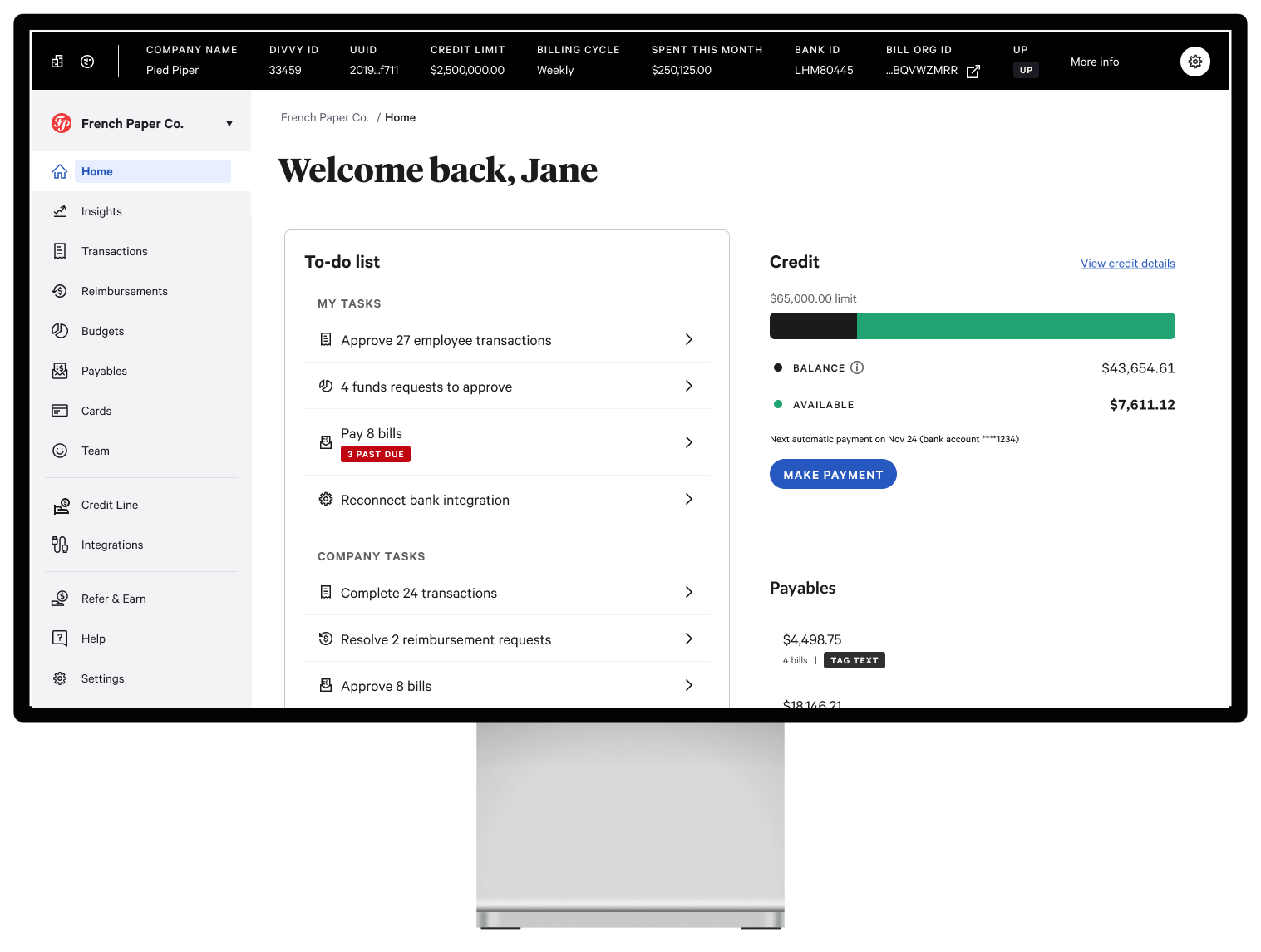
Due to the acquisition of Divvy by BILL, our products were merging into one product, called the Unified Platform, a One-Stop Shop for all customers. Currently, customer-facing employees from Divvy use a tool called Houston, while BILL customer-facing employees use one called the Ops Tool. As our North Star goal, we need a way to merge these tools into one product. But, in the interim, for our first milestone and in a matter of a few months, we needed a way for Houston users to be able to search for BILL and Unified Platform (UP) companies in Houston, and a way to deep-link those companies to the respective organization in BILL's Ops Tool.
With the addition of more information, we needed to design this to be as efficient and intuitive as possible.
How would we measure outcomes? Our main KPI is to reduce time spent on tasks/processes. Currently, Houston does not have an analytics tool. Discussions on that have been, and still are being held. For now, the measurement comes from direct feedback and observation. So far, each of our users is extremely excited and grateful for these changes, especially the fact that their UI / data pieces will be completely customizable. With the addition of the "Company Name + Divvy ID" column that I came up with*, some users were especially appreciative.
*Because I had noticed, in our initial discovery, that users would copy and paste the Company name and the Divvy ID each, tabbing between different tools to copy and paste back and forth, writing it as "<CompanyName> - <DivvyID>," I thought this would be extremely helpful and really speed up their workflow.
The All Companies page in Houston already provided so much data, and with that data, there was a lot of horizontal scrolling.
Within a company emulation page (basically, this is a fancy word for clicking into a company within the All Companies page and viewing the company details for that organization, much like a company's admin would see on the customer-facing product), there was also little to no space to add additional data in, right now, what we call "the sandbox" area.


Click on a thumbnail to expand and view all images
This was supposed to be a "simple" task. I was told, "Hey, we need to add search functionality to the All Companies page to include BILL and UP org IDs, and be able to deep-link into the respective Ops Tool if they were a BILL org. How will that be displayed?"
After first attempting to add these elements to the current UI, I realized these pages could definitely be improved. In other words, I thought, I need to redesign them, and redesign them in a way that makes an impact. Impacts for me are Outcomes over Outputs. That's where I decided it was time I sent out a survey to all customer-facing employees that currently use Houston.


Click on a thumbnail to expand and view all images
Click on a thumbnail to expand and view all images
Click on a thumbnail to expand and view all images
Click on a thumbnail to expand and view all images
Click on a thumbnail to expand and view all hidden images
Click on a thumbnail to expand and view all images
Click on a thumbnail to expand and view all images
With so much data already in Houston's All Companies [landing] page, adding more information (columns) would add so much additional noise to the grid, thus adding even more horizontal scrolling than there already was. When my PM, our researcher, and I conducted our interviews and shadowing sessions for our discovery work and roadmap planning for our new product area/focus, I had noticed that so much of the data within the All Companies page, as well as within the Company Emulation, were not being used. For this reason, I decided it would be best to send out a survey to all customer-facing Houston users. My goal was to see how often each of the data was being used, as well as how important they find each data piece to be. In addition, I included some concepts for ways to display information in order to a) see if they were open to change, and b) find a way to fit the key pieces of data they needed without affecting the height or width of the display area, thus having to push page-content down.
Click on a thumbnail to expand and view all images
Here is the research findings deck I put together that informed the designs for this project (really, they were two separate projects).
Click on a thumbnail to expand and view all images
Different Roles = Different tasks/workflows = Different Usage of Data
What does this mean for my designs? It means I concluded it would be best to give users complete control over their data grid. This would suit their roles, needs, and preferences. Not only does this include displaying and not displaying certain pieces of information, but also being able to reorganize it.


Click on a thumbnail to expand and view all images
Similar to the All Companies page, the company information section would be completely customizable based on user needs and preferences. The "Back to all companies" and "Back to all people" pages would also get moved to the company info bar, thus freeing up space within the side navigation, yet still being able to easily access each page.

Click on a thumbnail to expand and view all images
With the addition of the new utility nav that I helped another team design, and later to come, the company information section would get pushed above all content, including the new utility nav.
Also, designing for North-star for User Impersonation mode, which currently does not exist in Houston.


Click on thumbnail to expand


Click on a thumbnail to expand and view all images
With each project comes challenges. New/updated design system, called Trinity, for the Unified Platform (UP) product were not yet ready. I was a part of a small team to help inform the data grid component, including table cells, types of data cells, deep-linking, tags, and more. Our menu items were also not ready to be used, and therefore, I had to re-design the entire experience using the old "Hubble" design system that Divvy uses, (tables, list items, etc.). Also, with only one front-end developer, we had very little resource to get things delivered in a timely manner, at least according to what some stakeholders expected.
Since this was initially expected to be a "simple" project, and because I wanted to do my due diligence of designing a great experience for our users, sending out a survey also expanded the scope of the project and, thus, pushed the timeline by a bit. After all, it is outcomes over output that truly matters.
Click on a thumbnail to expand and view all images
Click on thumbnail to expand
I'm always interested in expanding my network or solving new challenges!


.png)


.png)


