

As the UX Interaction Designer, my responsibilities included creating User Flows, Whiteboard Sketches, Wireframes, Information Architecture, and Fully-Functional Prototypes for User Research / Usability Testing. I also helped with creating Personas and Customer Journeys, dabbled in some Visual Design, QA, and was part of a weekly to bi-weekly Research & Findings sessions.
As part of the hyatt.com Booking Flow, we wanted to completely reimagine the search experience. There are many factors that come into play when a guest searches for and decides on a hotel to book. They want to gain as much information as they can about the hotel, its features, and its location. Many guests would leave hyatt.com to find information they needed on other sites, a popular one being TripAdvisor for features and reviews, and Google Maps for location, proximity, and more. Hyatt.com was not serving this information upfront that our guests were seeking and that they found to be so useful and crucial to their decision-making.
Our goal for our redesign was to add contextual information to help guests make a more informed decision when searching for and booking a hotel on hyatt.com, thus giving them a much more intuitive, confident, and efficient search experience.
This redesign would help us build trust and confidence with our guests by focusing on providing the content they needed, making their search experience more enjoyable with user-friendly and intuitive interactions, while driving more conversions for Hyatt Hotels Corporation.
Throughout the project timeline, we were tracking analytics, conversions, etc. Although the numbers fluctuated due to an oversight at one point, to testing out different test variations, there was definitely a positive impact. Typically, the largest impact would be at the very beginning of a deploy, and it would dwindle down as time went on. However, on average, the increase was up by roughly 22%.
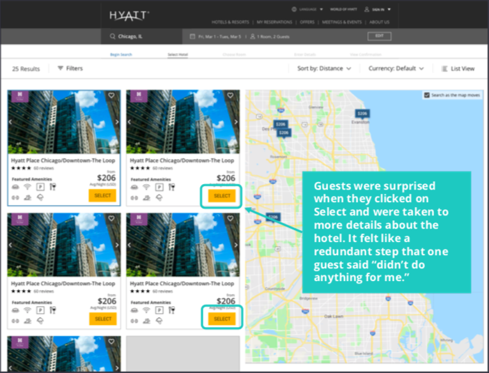
Here is what the old state of hyatt.com Search experience looked like before we began the redesign.
Some key interactions we wanted to change were interactions with the map, and between the map and list of results. Panning the map was not intuitive, especially on mobile-web, where the user had to use two fingers to pan the map, always making them wonder, "Why isn't this working?" Our guests were not clearly able to see a toggle between a list view vs the map. There was some disorientation between looking at a hotel and where it fell on the map.
Amenities lists were hidden into an expandable and collapsible link.


Click on a thumbnail to expand and view all images
As an initial start to this piece of the Booking Flow Project, the "Mighty Design Team", which included myself, the Visual Designer, and UX Researcher, along with the Product Owner, and a couple designers from a design firm, who helped us for a couple months at the beginning of the project, did some ideation and explored other sites and apps for some inspiration for what could better enhance our search experience for our guests. This included map interactions, feature integrations, filters, and other pieces of the experience. We created boards on Invision, shared ideas, and these helped us to synthesize results with common features that we were aiming to include in our redesign.
Much of our inspiration came from Airbnb, SpotHero, Zillow, other Real Estate Sites, and we also wanted to see what the rest of the industry was doing for their search, and how we can provide the best experience to our guests.


Click on a thumbnail to expand and view all images
After coming up with ideas and inspiration, our team agreed on features to include and start with in our initial designs. Here are some of my first wireframes.
For our list view of search results, I played with two orientations of layout: Horizontal and Vertical. Each posed its pros on cons, from real estate on the cards themselves for features and long hotel names to scannability and device real estate.
Each card would have on-page, in-card interactive image gallery. Reviews of the hotels, taken mainly from verified stays on TripAdvisor, would prevent guests from having to leave the flow to look at that site and others for review ratings. I also wanted to include top amenity icons on the card to help immediately inform guests of what amenities each of the hotels have. They'd also be given an option to "save" (heart icon) their favorite hotels, which later ended up being out of scope for most of the project timeline. Each hotel card would have distance from location of search, again, helping guests make more informed decisions and not having to look at Google Maps, for example, to see how far the hotel is from their point of interest.


Click on a thumbnail to expand and view all images
Below are some mobile views of the Search Results. I thought about things like, "How would the user interact with this? Would they swipe left and right between the cards? How about the pins? What happens when you tap on the pin? Would the respective card "pop up" or would it swipe among the cards into view? What would card details look like? Would it take over the whole screen? Or would a better interaction be less screen space?"


Click on a thumbnail to expand and view all images
We thought it would be a really important thing to include filters for search results. Hyatt.com had a "dream map" tool with a filters feature where we took our initial ideas from. After some initial iterations and usability test sessions, we'd later learn to find a better way to design our filters panel.


Click on a thumbnail to expand and view all images
Here are some further iterated wireframes. The left hamburger icon allows you to navigate through the pages.
Click on a thumbnail to expand and view all hidden images
After my first set of low-fidelity wireframes, I started going straight into more mid to high-fidelity mockups. Why? To me, it felt a lot more efficient. We already had a UI Library (which we would later update to a cleaner and more modern look), and already felt that we had a lot of direction with where we wanted to go with our designs and we wanted to start testing them pretty quickly to get user feedback to inform our decisions with future iterations.
Here are links to the desktop prototype map view and to the desktop prototype list view (passwords for each is HYATT2019), each made in Invision, where you can either interact with it or swipe between the screens.
And this is the mobile prototype which I made in Axure. Interactions you can do in this prototype:
Click on a thumbnail to expand and view all images
Click on a thumbnail to expand and view all images
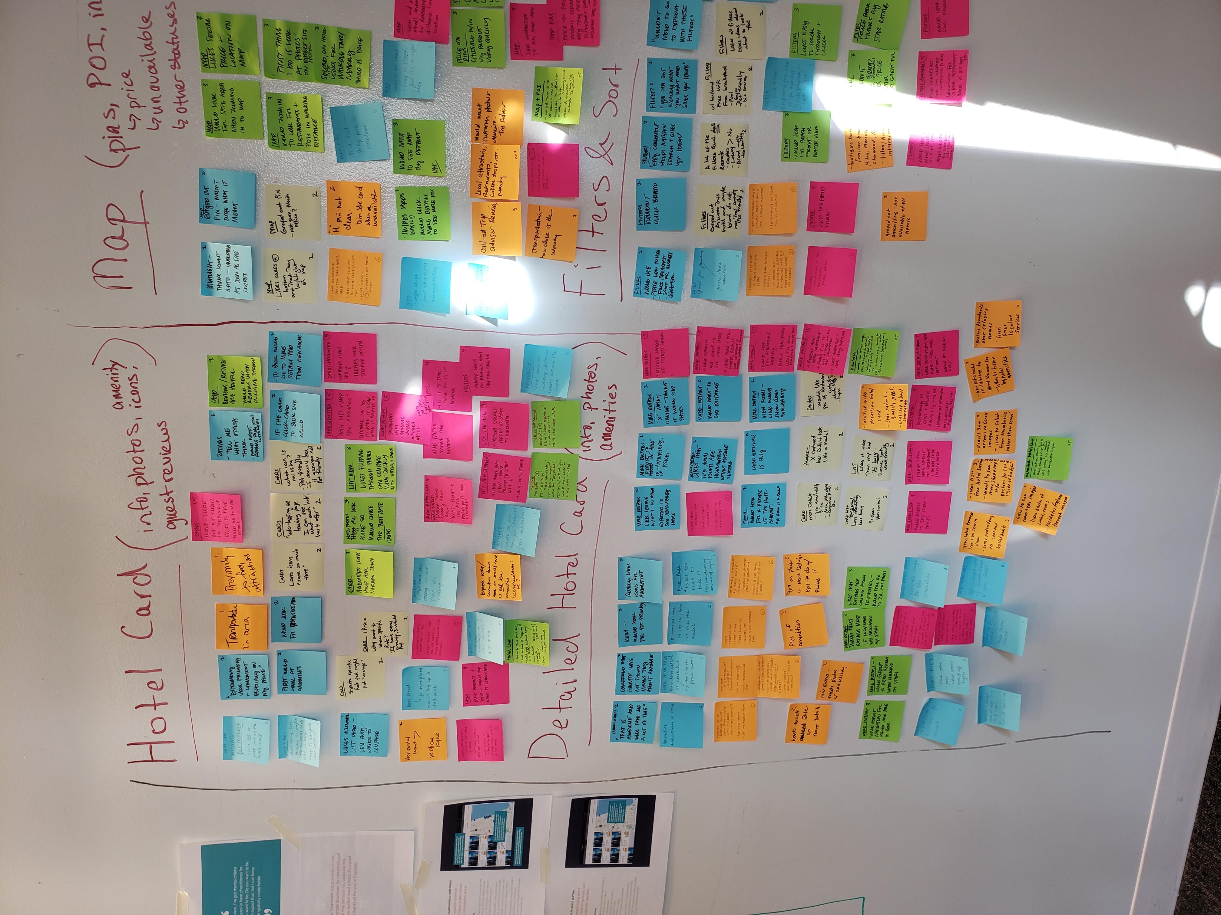
Button or No Button? Horizontal Cards or Vertical Cards? As a UX Designer, I believe Usability Testing and Research is one of the most valuable practices to include in a UX Process, as it helps to gain insight that will help inform decision making when it comes to designing a better experience for our guests. With different options to consider for design concepts, and stakeholders pressuring us to use one concept over the other, making uninformed decisions solely because they "like" it better, the best solution is to test them and measure the failures and successes for each. Whether the methodology chosen is something as simple as an A/B test, or a moderated user test, the results are extremely valuable. We also used a User Tracking, Analytics web-service called Fullstory, which allowed us to see our users interact with our digital experience, and it helped us discover some pain points.
My team and I began testing the designs as quickly as the following week of initial kickoff. We tested designs two weeks apart each round. We'd focus on Desktop one round, to Mobile another round. Our team had a designated UX Researcher, a great one, may I add :), who put together the test plans and conducted most of the test sessions, while our UX Research Manager conducted the rest.


Click on a thumbnail to expand and view all images
Our team tested the prototypes listed above, which gave us a lot of insight as to the type of content our guests are looking for, what pieces of information our designs are lacking, and whether our interactions were usable and intuitive. Here are some key findings based from our initial three rounds of tests:


Click on a thumbnail to expand and view all images
We gathered a lot of insight from our user test sessions where we could iterate in our designs. We also wanted to make it into a more modern and cleaner look. Our iterations were also tested along with our Rooms & Rates and Add-ons (Attribute-Based Selling) tests.
Throughout the project, we were testing cards with and without buttons and links. Cards without CTAs would have the entire card be the target-area for click (would guests know to do this?). One idea we tried was to use a FAB (Floating Action Button), made by Material Design, in place of a "Book" CTA. We played around with interactions for getting Hotel Details. Initial designs had the hotel card "slide" up for more details, which later proved to not be a good solution based on user testing feedback. It also messed with the flow of the experience. Other considerations for the cards included size, especially with the map toggle turned on and in map view. We played around with ratio of cards panel to map.


Click on a thumbnail to expand and view all images
We explored interactions with the Map Pins and Panning the Map. Hovering on a pin would provide a preview of the hotel name, along with the reviews / ratings. Clicking on the pin would focus the corresponding hotel on the left pane into view. We included a "Search as Map Moves" toggle that the user could switch on and off as he pans the map. We also changed the interactions of panning the map on mobile view from using two fingers, to the expected one-finger gesture.
Here is a prototype I made for the developers on my team to explain how the interactions work.


Click on a thumbnail to expand and view all images
Based on a lot of the user testing feedback, we wanted to include a list of all hotel amenities and four reviews with a link to read all views, as well as a pop-out link that would open the hotel website in a new tab. Here is a prototype I built using Axure to help the developers understand the correct interactions of this feature.

Click on thumbnail to expand
Property Comparison was quite a challenge. From placement on the cards, to the interactions, especially on mobile, due to development time constraints. The guest was only able to compare up to two hotels, which later functionality would allow up to 4. Here is a prototype I built in Axure.


Click on a thumbnail to expand and view all images
Every project comes with its own challenges. Probably our biggest challenge was designing across all devices. It's no news that mobile devices, especially those that are 320px wide, have minimal amount of real estate. As a designer, I make sure not to put too much content on a page, or inside a card, which creates too much noise and also creates cognitive overload. But, challenges like these are ones that I love to solve. After all, UX is a practice that involves problem-solving. With all the features implemented into the design, one very important consideration was localization. You may have noticed that in some of the design screens I've shared, that the currency is not in US dollars. The longest language is German, and so one habit that was important to pick up was to test designs in this language, among others.


Click on a thumbnail to expand and view all images
On Mobile-web, screen space is another limiting factor, between the URL field and the bottom tray, add that in with a Header and a Quickbook (editing the search), you're really short on vertical space. In order to solve this challenge, I talked with the Product Owner about whether it would pass "Legal" to hide the Header after few seconds. I also talked with developers about hiding elements upon scroll - would this conflict with panning the map? Having a team of people who are just as passionate as I am to solve these issues is really helpful.

Click on thumbnail to expand
Our challenges did not stop there. Our design for Property Comparison was completed in a manner that would allow the developers to complete based on time constraint, but one that I wasn't entirely satisfied with. Hey, can't win 'em all! It was the best "viable" solution for our Minimum-Viable-Product. That was the rationale. These are the type of challenges and conversations I sometimes find myself in, and I find it important to state my rationale, and come up with alternative concepts that everyone is happy with, at least for the time-being.
One final challenge I'd like to mention is running into things like "conditions." I designed User Flows for what happens in certain scenarios, such as "no search results," "one search result," etc. I asked myself questions like, "What do we show in the list view? What do we show in the left card pane of the map view? What happens to the map? Does it take up more of the screen width?" These things took lots of thought and discussions with my team.
“Everything is at your fingertips...it’s convenient...[The icons] are awesome. That saves you so much time right there.
"It's easy to use...easy to navigate."
"I’ve got mental criteria that I couldn't really expect you guys to have checkboxes for: 'How far off Michigan Ave do you want to be? Do you want to be on a side street or not?’...I can keep track of that here and it helps me spatially relate better."
I'm always interested in expanding my network or solving new challenges!


.png)


.png)


