

As the Experience Architect on the team, I was responsible for creating the user flows, information architecture, wireframes, and the interaction design.
The goal of the project was to provide members with a consolidated and consistent platform for messaging and alerts. It was also imperative that we streamlined and integrated "Manager Preferences."
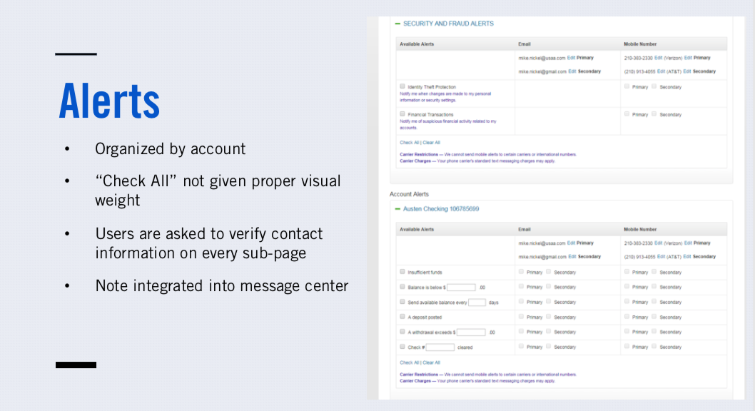
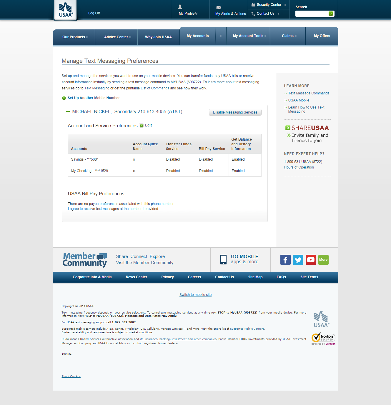
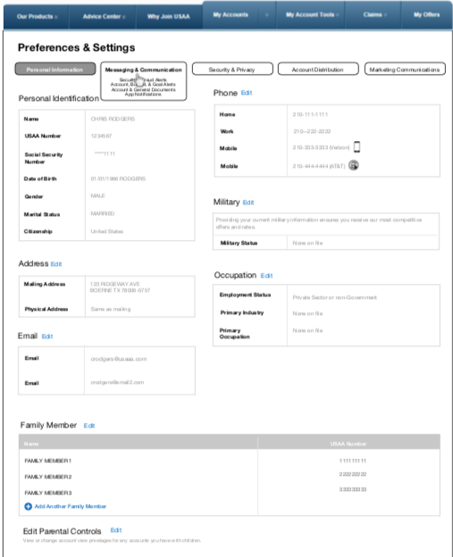
The current state of "Preferences" was a complicated categorization system:


Click on a thumbnail to expand and view all images
Click on a thumbnail to expand and view all images
I was given a few excel spreadsheets with content for Message Center, such as the Content Type (e.g. Message), Message Category (e.g. Urgent; Notification); the actual messaging (e.g. Your account is past due...), the CTA (e.g. Pay Now; View Details), and couple other elements.
I worked on this project for about two months and checked in with my team and also the stakeholder quite frequently. I wanted to make sure that what I was designing was aligning with the goals the stakeholder had in mind. In addition, I wanted to have confirmation that the interactions and flow would be feasible for the scope and timeline of the project.
Here you will find a short PDF of some of my initial wireframes for Desktop. By the end of the project, I delivered a full deck of the most updated flow of the screens. Below are just a few screen examples, but the assets are clearer in the deck.


Click on a thumbnail to expand and view all images
I took some of my inspiration from Bank of America's Mobile App for the Mobile Designs of USAA's Message Center.
Here you will find a short PDF of some of my initial wireframes for Mobile. By the end of the project, I delivered a full deck of the most updated flow of the screens. Below are just a few screen examples, but the assets are clearer in the deck.


Click on a thumbnail to expand and view all images
Click on a thumbnail to expand and view all images
Click on a thumbnail to expand and view all hidden images
Click on a thumbnail to expand and view all images
Click on a thumbnail to expand and view all images
Click on a thumbnail to expand and view all images
Click on a thumbnail to expand and view all images
Click on a thumbnail to expand and view all images
Click on a thumbnail to expand and view all images
Click on thumbnail to expand
Click on a thumbnail to expand and view all images
Because I was not a member of USAA, I could not log in to see the current flow first-hand to get a sense of the current experience. I was reliant on screenshots from the stakeholders in Houston, and still shots can only depict so much. I wanted a chance to truly interact with the experience so I could get a feel for what needed work. One person on my team had an account, but it was really private (funds are shown and such), so that was extremely limiting. All-in-all, my wireframes and flows were well-received by the stakeholders.
Click on a thumbnail to expand and view all images
Click on thumbnail to expand
I'm always interested in expanding my network or solving new challenges!


.png)


.png)


