

As the UX Interaction Designer, my responsibilities included creating User Flows, Whiteboard Sketches, Wireframes, Information Architecture, and Fully-Functional Prototypes for User Research / Usability Testing. I also helped with creating Personas and Customer Journeys, dabbled in some Visual Design, QA, and was part of a weekly to bi-weekly Research & Findings sessions.
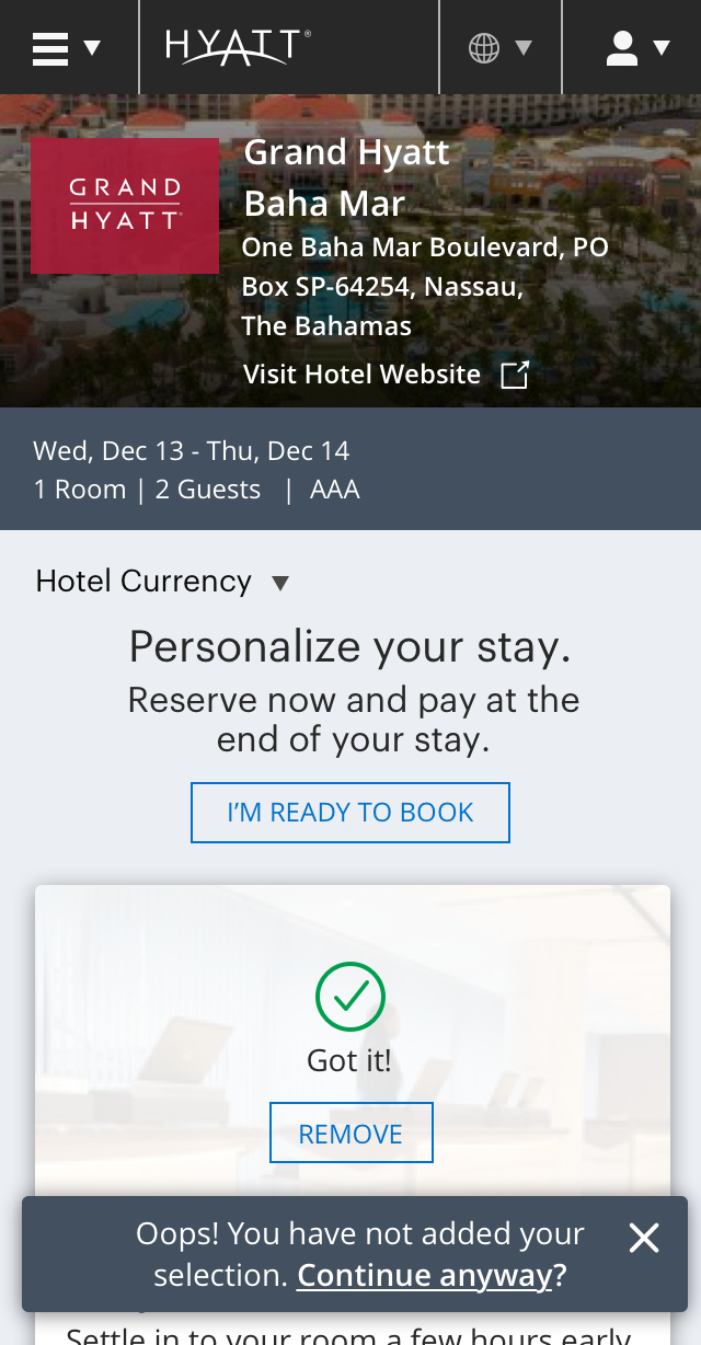
As part of the hyatt.com Booking Flow, we wanted to completely reimagine the rooms, rates, and personalization experience. Guests have several decision points to make when choosing a room to book. They want to know what each part of the room looks like, what the views are, what's included in the room, what the key differentiators are between the rooms options, how much the room is per night and for their whole stay, what the cancellation fees are, and more. They want to gain as much information as they can about what their stay would be like. Many guests would leave hyatt.com to find information they needed on other sites, a popular one being TripAdvisor for features and reviews.
Our goal for our redesign was first to break down the room selection into smaller steps to reduce cognitive overload that was found in the existing experience, as you will see in the Where it Began section. In addition to that, we wanted to add in contextual information to help guests make a more informed and confident decision when selecting a room, rate, and add-ons on hyatt.com, thus giving them a much more complete and immersed experience.
This redesign would help us build trust and confidence with our guests by focusing on providing the content they needed, making their room selection and personalization experience more enjoyable with user-friendly and intuitive interactions, while driving more conversions for Hyatt Hotels Corporation.
We rolled out our MVP design to 14 pilot hotels, increasing the percentage of targeted users as time went on. Throughout the project timeline, we were tracking analytics, conversions, etc. We also were able to view recorded and live sessions from our targeted audience' experiences using FullStory, which was really helped us gain visual insight as to what was working and what wasn't, and where users were dropping off.
If I remember correctly, before I left Hyatt, the test was up about 8% in conversion for the MVP roll-out. Add-Ons were pretty minimal in the beginning, but really started to pick up after a month or two, of course after iterating and adding better functionality. This, of course, really helped increase business revenue.
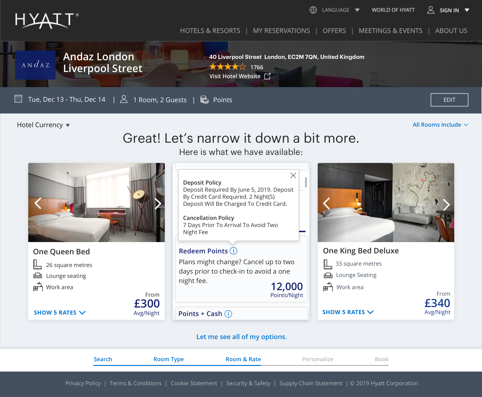
The existing Rooms & Rates page on hyatt.com required guests to digest and compare multiple types of information in order to make a decision. It was overwhelming with too many options to choose from, making difficult to compare, and creating cognitive overload. Our goal was to break it down into a step-model, which would give the guest a more simplified, faster, easier, fun, and seamless experience, one that would allow them to focus on the task at hand and meeting their needs.
Below is a snapshot of what the current Rooms & Rates page looked like before our redesign. Some of the decisions that had to be made from the Rooms & Rates page were:
Hypothesis: By unbundling room level decisions into steps, separating “packages” from the room decision, guests will be able to more quickly and easily book a trip that meets their personal needs and be more confident about their booking, leading to higher satisfaction with Hyatt, increased bookings and higher revenue per booking.


Click on a thumbnail to expand and view all images
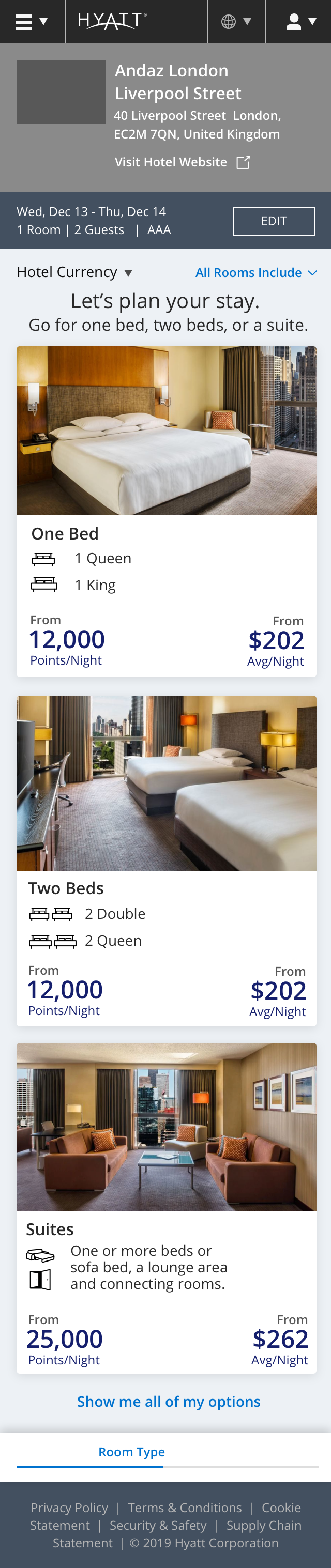
I came into the project a little after Phase 1 of the redesign. With some learnings from the first prototype, I put together a new proposed user flow in Axure to illustrate what the entire booking experience would be like. The new step-model of the Room and Rate experience comes after the hotel selection point. Add-ons (aka Enhancements or Personalization) comes after the step-model of the Rooms & Rates section.
We then shortly tested our Phase 2 designs with 20 non-member participants, using an unmoderated user testing methodology on UserTesting.com. The test participants were given scenarios and tasks and asked to complete them using this prototype I built, also in Axure. Here are the steps to take to advance through the flow (of course, these were not given to the test participant):
The goal of Phase 2 was to build off the step-model of Phase 1 with some research findings from Phase 1, but with some new interactions and a different hotel to choose from that had similar room types. Here are the research findings from Phase 2 Testing:


Click on a thumbnail to expand and view all images
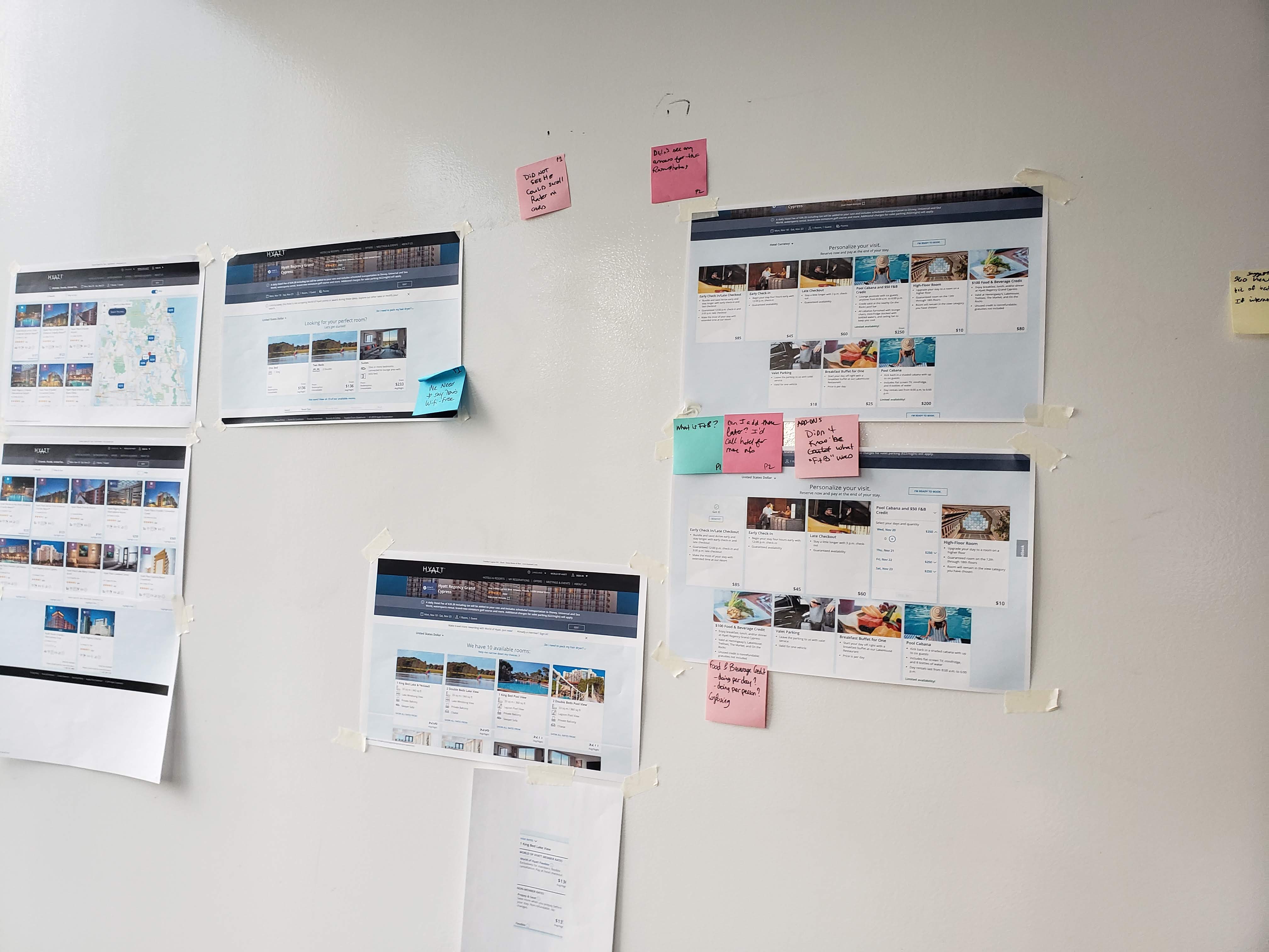
With much insight gathered from the first two phases of the project's usability tests, it was time to start iterating on the designs, and even revisit the flow. In the Early Iterations section, you'll find some of the findings we incorporated into our iterations. We also decided to remove the "Room Category" part of the flow as it was found to be confusing.


Click on a thumbnail to expand and view all images
We decided to lay out all the add-ons in one page, rather than in slider sections:


Click on a thumbnail to expand and view all images
Click on a thumbnail to expand and view all images
Click on a thumbnail to expand and view all hidden images
Test participants found it to be really easy to scan the information on each of the room cards from our Phase 2 test, but some suggested it would be nice to have them listed in a particular order. From surveys distributed, the most important attribute guests wanted to see was each of the room's square-footage, so we incorporated that. It was also important to have the key differentiators listed in the room cards. With the common amenities, guests found it redundant to list them under every room as it was in the current experience, so we opted to we put them in an expandable link.


Click on a thumbnail to expand and view all images


Click on a thumbnail to expand and view all images
As a UX Designer, I believe Usability Testing and Research is one of the most valuable practices to include in a UX Process, as it helps to gain insight that will help inform decision making when it comes to designing a better experience for our guests. With different options to consider for design concepts, and stakeholders pressuring us to use one concept over the other, making uninformed decisions solely because they "like" it better, the best solution is to test them and measure the failures and successes for each. Whether the methodology chosen is something as simple as an A/B test, or a moderated user test, the results are extremely valuable.
My team and I tested designs one to two weeks apart each round. We'd focus on Desktop one round, to Mobile another round. Our designated UX Researcher put the test plans together and conducted most of the test sessions, while our UX Research Manager conducted the remainder of them. I, myself, also led a couple of the research test sessions.
Here is the mobile prototype we tested and a desktop version, each of which I made in Axure. Test participants were given a scenario and asked to choose a room and rate accordingly using the prototypes. The mobile prototype works better on a Mobile phone. If using iPhone, after loading the prototype, triple tap on the the screen, and choose "Scale to fit width". Interactions you can do in this prototype:


Click on a thumbnail to expand and view all images
Our tests gave us a lot of insight as to the type of content our guests are looking for, the pieces of information our designs are lacking, and whether our interactions were usable and intuitive. Some key findings we found were:
Click on a thumbnail to expand and view all images
Here are some of the further iterations we made on the designs based on the test feedback


Click on a thumbnail to expand and view all images
Guests wanted more info as to how much their total would be, I played around with different layouts and interactions for displaying the breakdown between the room rate and the add-ons they've selected, and to display the total. Also, what would happen if they clicked on that panel.


Click on a thumbnail to expand and view all images
Click on thumbnail to expand
Click on a thumbnail to expand and view all images
We encountered several challenges for the Rooms & Rates and Add-Ons portion of the newly designed Booking Flow. Similar to the challenges found in the Map-Centered Search project, real-estate was a consideration to keep in mind. Again, we needed to keep localization in mind, making sure that languages, such as German, would fit appropriately into the designs. The information icon on the Rates modal in mobile was also something I needed to play around with where there was enough clearance between two touch-target areas.
Adding onto the real-estate issue, another challenge we encountered was that the interaction for viewing the rates for each room card was tricky. We really wanted the guests to be able to compare all the rates between each of the rooms, and the best solution for that was to display them "in" the card, rather than in a modal, so that they could easily scan the page. However, because there was really small amount of real estate, I tried to come up with other designs, such as making the cards expand, or having them open a side panel, which would then push the other cards in that row off to the side. I discussed varying solutions with the Dev team, but because of how the cards were laid out and coded, it would either have to be completely re-coded, or have varying lengths of the cards.
Because this was an MVP, our scope was refined. But, I took the liberty to come up with some of my own explorations for post-MVP. Here are those designs:

.png)


.png)
.png)


Click on a thumbnail to expand and view all images
After viewing several candidly recorded sessions of guests using our MVP product on FullStory, it became evident that there were a lot of drop-offs during the Join/Sign in flow during and after selecting a room rate. Some were stuck and didn't know how to advance. Other issues were also witnessed. Because of this, I re-RE-designed the flow and also made mockups for this new proposed flow and added interaction annotations for the developers on Zeplin.
Click on thumbnail to expand
"I actually enjoyed the experience because it kind of guided me through it. It had different room types , but it wasn't so many that it got too overbearing. Everything was understandable."
"The descriptions of the various rooms and views made the selection very fast and easy...it made sorting the rooms out much easier and also the
option to add the extras at the end. It made the booking process more enjoyable."
"Very simple, very clean and easy to understand. You guys did a great job with the site."
“It was a nice way to make sure I will have everything I need when I arrive.”
“Great - differentiator between Hyatt and Marriott Bonvoy!”
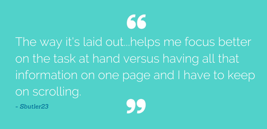
"This actually helps me plan my stay better instead of figuring out what to do when we get there."
I'm always interested in expanding my network or solving new challenges!


.png)


.png)


