

As the UX Interaction Designer, my responsibilities included creating User Flows, Interaction Design, and Fully-Functional Prototypes for User Research / Usability Testing.
The goal of this project was to implement a new feature in the booking flow that would allow members to book their stay in a more flexible way by allowing them to redeem their points and awards however which way they wanted. At the time, the only way to accomplish this online was by booking separate reservations. The alternative was to book through an agent at the call center, which actually was the only way to redeem awards. These were huge pain points, which caused much frustration among the members.
Clearly we had a gap to fill. The ability to redeem both points and awards while booking a reservation online would solve an ongoing problem. In addition, the feature would help guests maximize the value of their points and awards with the designs that would be implemented. All in all, our hypothesis was that Award Booking (a temporary name for given for the product) would result in an increase in online bookings and decrease calls to the call center. Thus, it would be an all-around win for both the guests, for the call center agents, and for the business.
Click on a thumbnail to expand and view all images
Before getting my hands on this project, an outside agency had already made some initial designs for a Proof of Concept. We tested these designs using a prototype I built in Axure, along with our early MVP concepts (see Early Iterations)in late July 2019 with loyalty members who had points and free night award redemption experience. This helped us gain some insight as to the functionality, usability, information architecture, and content of the current mockups that would help inform our designs for the MVP.


Click on a thumbnail to expand and view all images
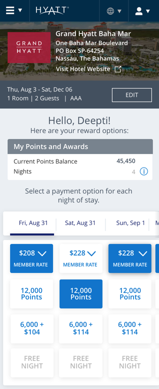
We learned that the grid layout concept on Desktop was well-received for a few reasons, one of which that it builds upon the members’ mental model due to its similar to a spreadsheet. Members liked being able to play around with different combinations and see the running totals in real-time. However, there was a definite disconnect between the users points and awards balance at the top and the totals at the bottom.
We also found that members were seeking information about the expiration dates on their free night awards and which of their awards will get “applied” first based on those expiration dates and the hotel categories. They also valued knowing the different levels of the awards, which are based on Hotel Category, and the eligibility for redemption (sounds confusing, I know). Maximizing the value on their points and awards based on the hotel category were really important, too.
In addition to these findings, much of the interactions needed some re-thinking, such as conditional grayed out “free night” selections, date selections, balances and running totals, and others.
Click on a thumbnail to expand and view all images
Click on a thumbnail to expand and view all images
Click on a thumbnail to expand and view all images
Click on a thumbnail to expand and view all hidden images
Based on the research findings from our initial test, we designed a few concepts for our MVP that would incorporate some of the insight gathered.
Below are some of our initial MVP designs that reflected these findings. We took a mobile-first approach to the design concept.


Click on a thumbnail to expand and view all images


Click on a thumbnail to expand and view all images
My team and I conducted multiple rounds of moderated remote usability tests using UserTesting.com, usually every single week. This project was extremely fast-paced, as we iterated quickly; sometimes we’d iterate the designs and update the prototype between sessions based on findings within those test sessions.
We first focused on mobile exploration, as mentioned earlier, and tested them first in order to create a seamless experience. Our goal was to explore open questions about the Award booking desktop experience and elicit feedback on mobile concepts. These would then help inform our Desktop designs (shown above in Early Iterations).
Round 2, we tested our Desktop designs with a prototype I built in Axure. One of our goals was to see how to raise awareness among our members. How do we call attention to the new feature on the existing Rooms and Rates page? What is the clearest, most effective language for the CTA label? We also sent out surveys and worked with the Content Team and a Copywriter to help make our decision.
For Round 3, we tested refined designs using prototype I built for both desktop and mobile based on the feedback given.
Disclaimer: The mobile prototype works better on phone, since the drawer (tray at bottom) is not displaying accurately on desktop-web. If on iPhone, triple tap 3 times and click on “Scale to fit width.” You can turn on hot spots to show interactive touch targets. Below are the mockups [Insert Round 3 Refined]


Click on a thumbnail to expand and view all images
We identified opportunities to build upon this new framework and provide more value to our members moving forward.
There was a conflict with having the sticky drawer at the bottom because that interaction was being used for something else in World of Hyatt’s mobile app.
Recommendation: I came up with idea to instead provide a sticky top drawer with quick view of running balances and payment summary so that the members will see the necessary information dynamically updating as they interact with the grid. This would reduce the number of clicks that would be necessary to go back and forth between the expanded drawer and the interactive gird, otherwise.
In general, members felt that scrolling vertically for dates is more natural while scrolling horizontally is more cumbersome.
Recommendation: Orient the dates vertically and payment options horizontally, so that it will reduce the amount of horizontal scrolling, which members felt was more cumbersome on mobile.
Recommendation: Move it more closely tied to the points balance
Click on a thumbnail to expand and view all images
We iterated further on our designs and conducted more usability test sessions. Here was where they were last left at before I needed to move onto another project:


Click on a thumbnail to expand and view all images
Click on a thumbnail to expand and view all images
Click on thumbnail to expand
Click on a thumbnail to expand and view all images
We encountered several challenges for the Award Booking feature. It was probably the most challenging project that I have been a part of, to date.
First, as with the Map-Centered Search and Rooms & Rates and Add-Ons, real estate was a limitation, especially on mobile. With the grid, localization, and needing to fit long currency on small tap targets were huge considerations with the design layouts.

Click on a thumbnail to expand and view all images
Also, with minimal vertical space on mobile, designing solutions for the stay breakdown and balances was also challenging. And, with mobile-web, the URL bar, the Hyatt Header, the Hotel Masthead, and Quickbook took majority of the vertical space. I am happy that my solution for the sticky quick view drawer at the top solved much of the problem between having to scroll all the way down and back up, but, it did add to the consumption of real estate from the grid, which was the main focus and interaction point.
Scrolling horizontally on the Mobile version was also problematic, mainly due to the fact that scrolling horizontally on iPhone’s mobile browser takes the user back a page. We really needed to prevent this from happening, because 1) it’s not good UX, and 2) the selections, if any made, would not be saved.
Probably the most challenging, however, was due to the rules and conditions for how guests were able to redeem their awards. Expiration dates, Hotel Category, Eligibility, Order of Redemption, and more were all considerations to the flow, and really limited some of the feasibility with using the Award Booking tool. To make these flows and rules clear to the entire team, and especially for the devs, I created User Flows and Conditions for Desktop and Mobile-Web (with interaction rules) for the earlier iterations and the new ones.
https://7f08ff.axshare.com/?id=a04ae5b4c806405f98de4219ea908564
Click on thumbnail to expand
"[It’s] a great format for visualizing how you can interact with all of the many options that are available for paying...It's a very organized way of doing the math on what makes the most sense, what is going to be out of pocket, how many points is that going to leave me with. It does all that for you."
“This is absolutely excellent!” / “...a matrix of what I kind of do” / “love that I can, in one place, select...”
“This gives you basically all the flexibility and the power in your hands.”
I'm always interested in expanding my network or solving new challenges!


.png)


.png)


