
.png)
As the squad Product Designer, I was responsible for sending out a research survey, creating design concepts, testing them, iterating on them, and finalizing the designs.
Divvy holds hackathons once or twice a year. I'd always had the idea to create a "Quick Actions" floating action button to accelerate our customers' workflows. This would include creations for cards, budgets, and reimbursements; making an account payment; sending and requesting funds; and adding people. So, I posed a question to my team: "What are your thoughts on doing this for our hackathon?" They all said yes! Woohoo! So, I named it "Quacktions"!
In order to perform any of the actions listed above, the user would have to go to the respective page and then click on "Create," thus having to leave their workflows or the page they were on to do so. I thought, "We could do better," and that's where this began. I knew a feature like this would improve efficiency for our users, and reduce clicks and time spent on tasks.
Click on a thumbnail to expand and view all images
Click on a thumbnail to expand and view all images
For the first set of iterations, we (Divvy Design Systems) didn't have a Floating Action Button (FAB), so I introduced one. We also didn't have a "dynamic panel' to open up upon clicking on the FAB, so these were the designs I came up with.


Click on a thumbnail to expand and view all images
Click on a thumbnail to expand and view all images
Click on a thumbnail to expand and view all images
Click on a thumbnail to expand and view all hidden images
Click on a thumbnail to expand and view all images
Click on a thumbnail to expand and view all images
With this idea in mind, I wanted to find out where people would expect to have a the quick actions button. So I decided to conduct research for any unanswered questions I may have had. Also, because each role would have varying permissions on what they can or cannot perform, I wanted to figure out the sort order of all the actions available for them upon clicking on the Quick Actions floating action button (FAB). I wanted to find out their mental models, finding which actions they would perform the most frequently, as as whether or not they'd expect those actions to be close to the button (so, order from bottom to top), or vice versa (top to bottom).
This is the maze test I sent to our for usability testing #internal-ux-research channel in slack.
Click on a thumbnail to expand and view all images
Most people expected to find the Quick Actions FAB on the bottom-right corner, as it is placed. In terms of frequency and importance, as well as sort order from top to bottom and vice versa, it was pretty split, with two people expecting the order to be from top to bottom. So, we placed each of the "Create" actions towards the top, with fund requests to be towards the bottom, as well as Add person and Make account payment.
Click on a thumbnail to expand and view all images
This was the video of our hackathon project that I put together and presented in a matter of 20 minutes. We had to present it to the whole Product team. I was rushed (we only had less than a week to complete this project and put together a presentation). WARNING: It is quite cheesy, and let's just say that I should never be a voiceover. I'll keep being a designer.
Click on a thumbnail to expand and view all images
Quacktions was a big hit!! So, we decided to...BUILD AND DELIVER IT! Yay! Now, it was time to really define the Floating Action Button (FAB) button in the design system, as well as the treatment and menu items of it!
I also needed to design for each of the roles and permissions we had:
Admin
Spender / Member
Budget owner
Bookkeeper - Budget owner
Bookkeeper - Budget member
Bookkeeper - Budget owner AND member
Bookkeeper - Removed budgets
These were the final designs!
Click on a thumbnail to expand and view all images

Click on thumbnail to expand
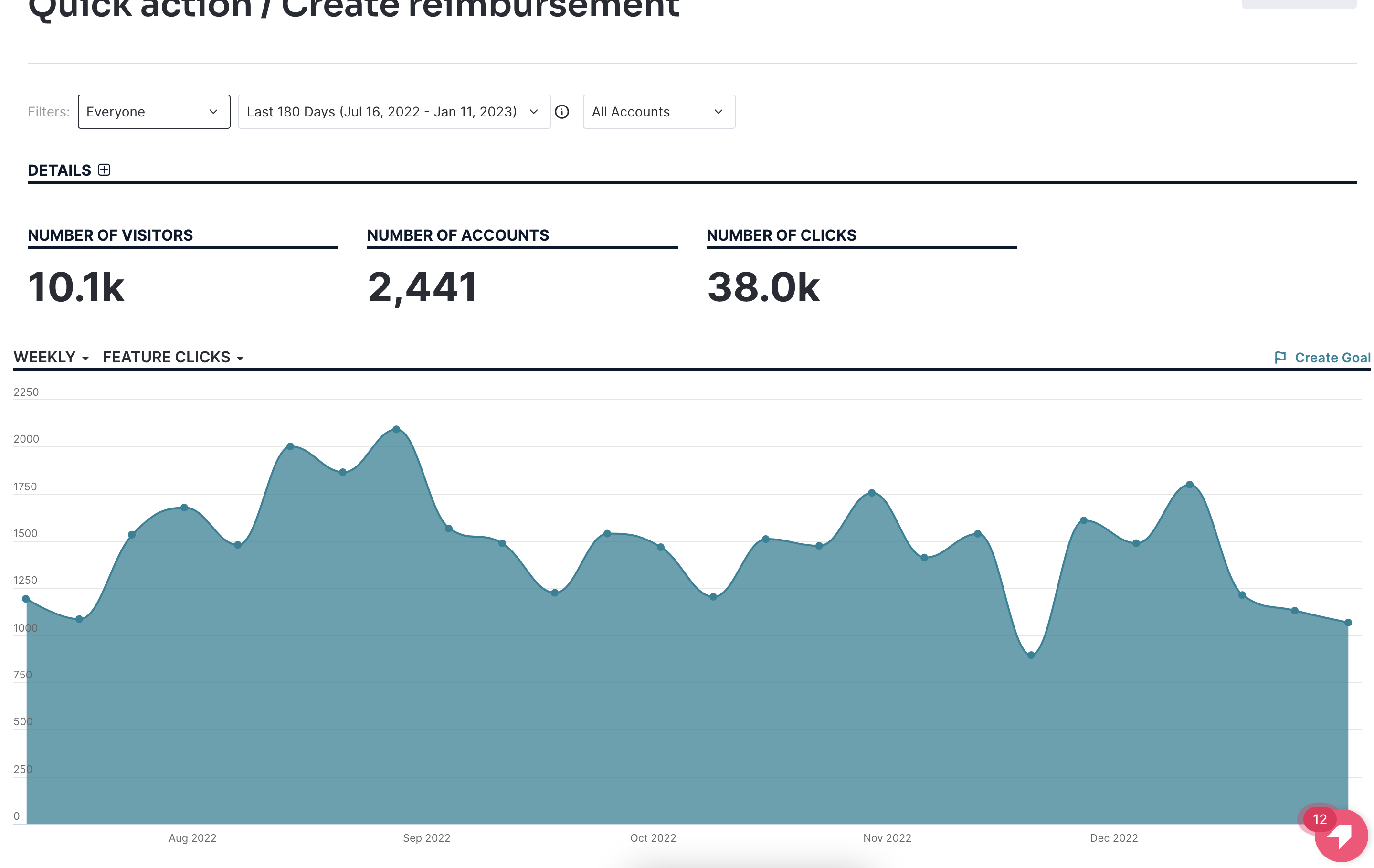
Here are graphs of the number of uses over the last 180 days. This feature was launched right then. Note that users like our members and spenders mainly use the app to perform any actions and tasks they need. So let the numbers speak for themselves!


Click on a thumbnail to expand and view all images
Click on a thumbnail to expand and view all images
Click on thumbnail to expand
I'm always interested in expanding my network or solving new challenges!


.png)


