

As the Experience Architect on the team, I was responsible for creating the wireframes and building the prototypes to portray the Interaction Design.
The objective was to create a one-line global navigation for logged-in members that respects their time by helping them easily find what they need.
In the process of designing a one-line navigation
The Global Nav redesign would need to align with USAA's Experience Principals:
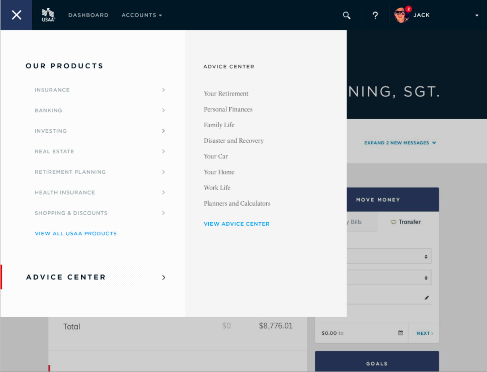
USAA’s current global navigation contained a massive number of navigation links. We felt it was necessary to simplify this navigation by providing less sub-navigation items, and instead alleviate the overwhelming feeling USAA Members have by focusing more on the high-level categories in order to enable them to reach their intended designation in a quicker manner.


Click on a thumbnail to expand and view all images
Our team, including the Project Manager, Creative Director, Content Strategist, and Creatives (Visual Designers) kicked off the project with a brainstorming and sketching session. We wanted to figure out the best solution for designing the navigation based on USAA's Experience Principles. Several questions were raised among the group, such as structure, layout, and interactions. We conducted a Card Sorting exercise with members and non-members of USAA, and we also looked for inspiration across different industry websites. Our decision was to come up with a few different concepts for the stakeholders, ones that we would then test to find out the best solution.
Click on a thumbnail to expand and view all images
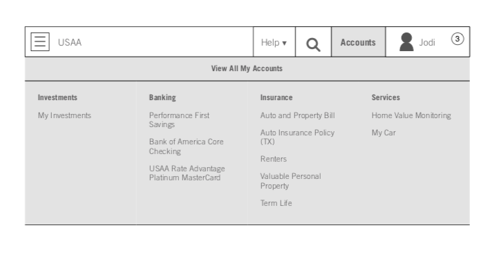
We decided to streamline the Global Navigation by removing most of the sub-navigation items. With this concept, members would see a much cleaner, simple navigation bar with only a few top-level menu items, still allowing them to easily access their dashboard, profile, products, and anything else that USAA.com provides.


Click on a thumbnail to expand and view all images
Concept 2 provides financial insights and updates to inform members as they browse. This navigation makes managing finances and insurance a unique and compelling experience. The imagery and customization of Concept 2 quickly surfaces content that is unique to the member.


Click on a thumbnail to expand and view all images
Customized navigation divides all account information into main life event categories e.g., car, home, finances. These categories can be personalized to offer up relevant solutions to members


Click on a thumbnail to expand and view all images
Click on a thumbnail to expand and view all hidden images
I made higher fidelity wireframes and put them into context of the page.


Click on a thumbnail to expand and view all images


Click on a thumbnail to expand and view all images
Click on a thumbnail to expand and view all images
Click on a thumbnail to expand and view all images
The Creatives (Visual Designers) on my team completed the visual design on my wireframes to bring them to life. I then built two rounds of prototypes to simulate the interactions between each of the concepts. These prototypes reflect the each of the visual design screens and states. The first prototype reflects two of the original concepts for Global Nav, and the second prototype tied a different project, called My Accounts, with the new Global Nav. Again, you may click on "Show hotspots" toggle which is in the side navigator, this time, since it was built in an older version of Axure.


Click on a thumbnail to expand and view all images


Click on a thumbnail to expand and view all images


Click on thumbnail to expand
Click on a thumbnail to expand and view all images
Click on a thumbnail to expand and view all images
Click on thumbnail to expand
I'm always interested in expanding my network or solving new challenges!


.png)


.png)


